Helping Hand
Better Together
People experiencing hardship are increasingly struggling to access the support, resources and opportunities they need. This has contributed to greater isolation and disadvantage within communities, leaving individuals and families uncertain about where they can turn for help.
By creating an identity built around connection, trust and community, the organisation feels more accessible to people who may be unsure where to turn for support.
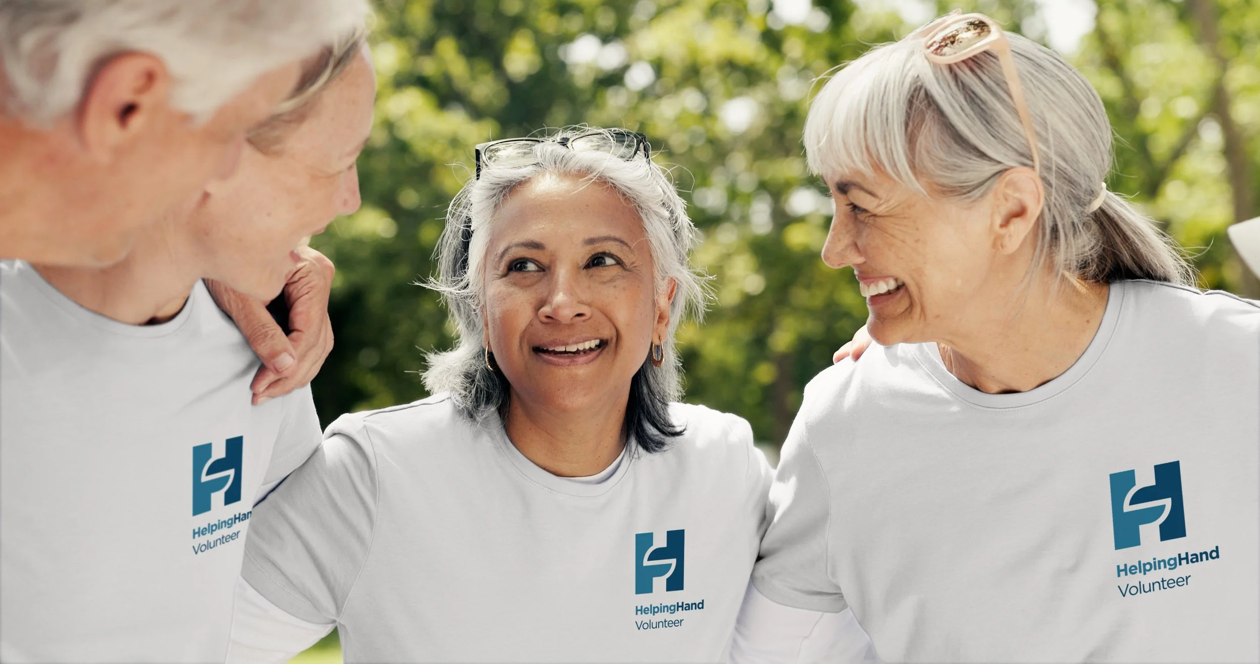
Each element of the identity was then aligned with Helping Hand’s focus on community, support and positive local impact.
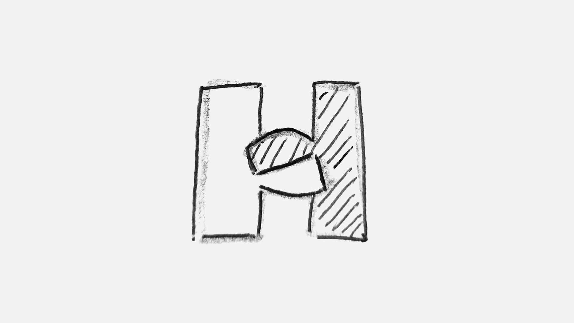
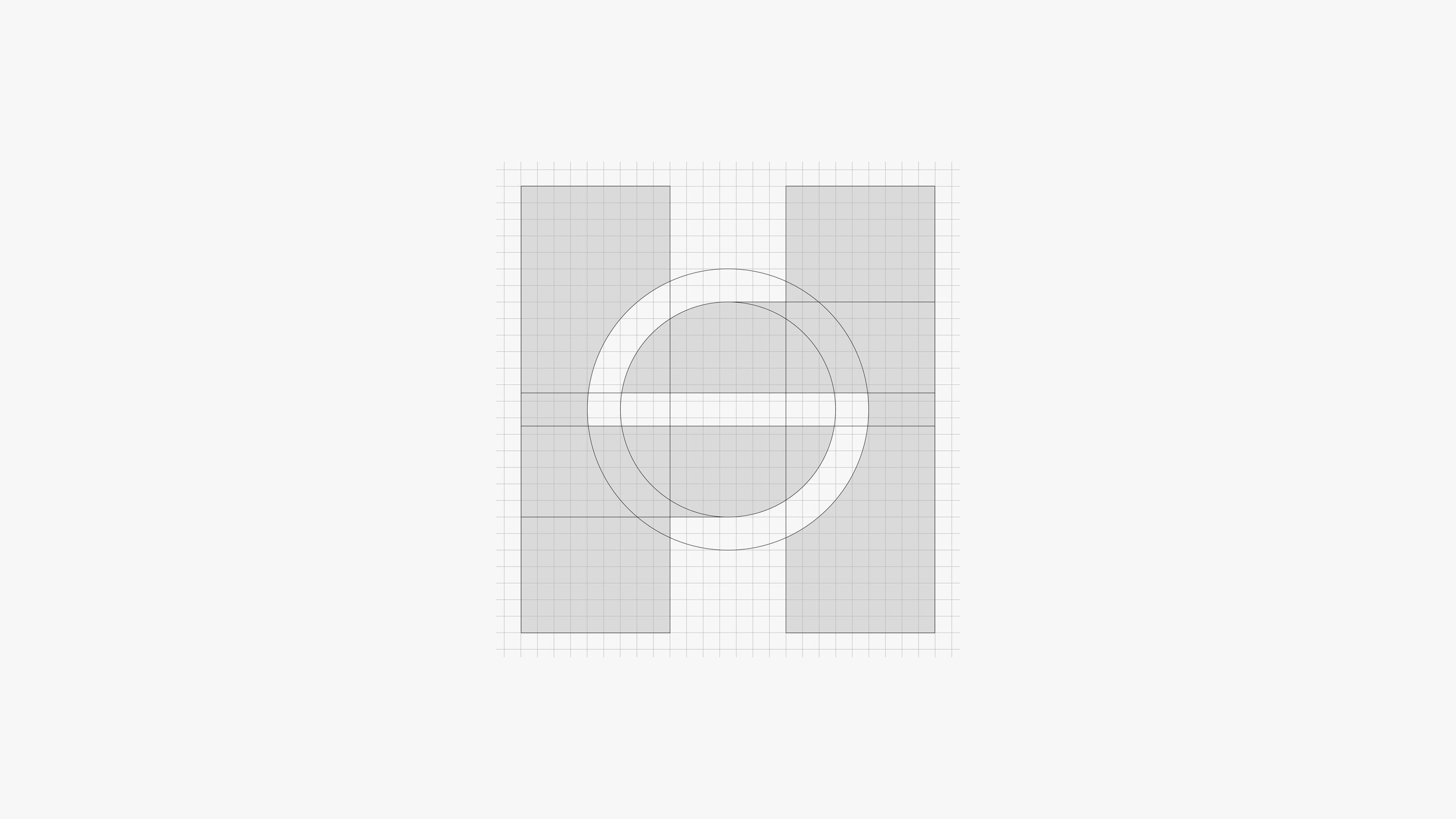
The new icon combines the letter H with two hands reaching towards one another, suggesting connection, support and community. These ideas resonate deeply within the organisation’s values of trust, reliability, partnership and helping others.
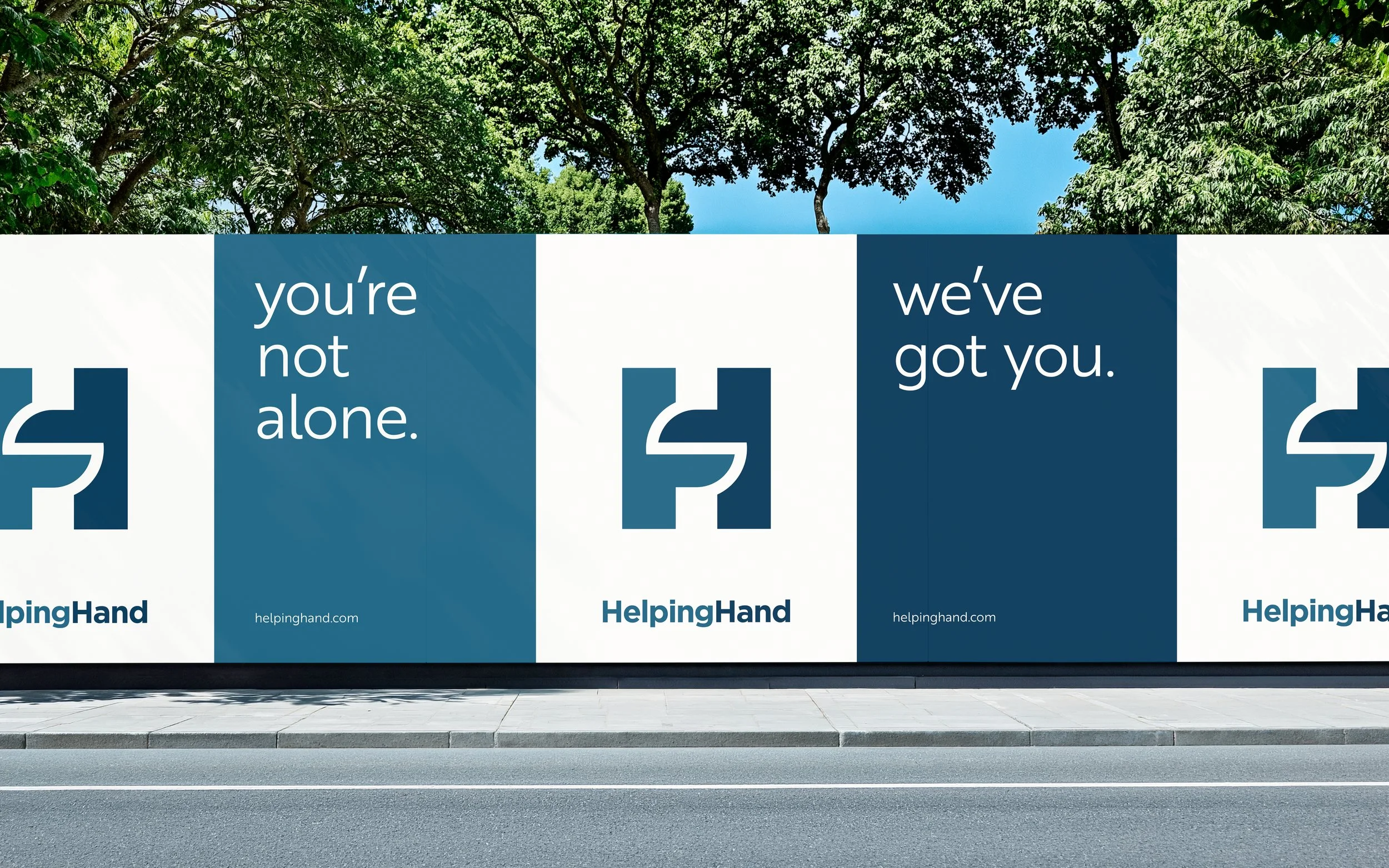
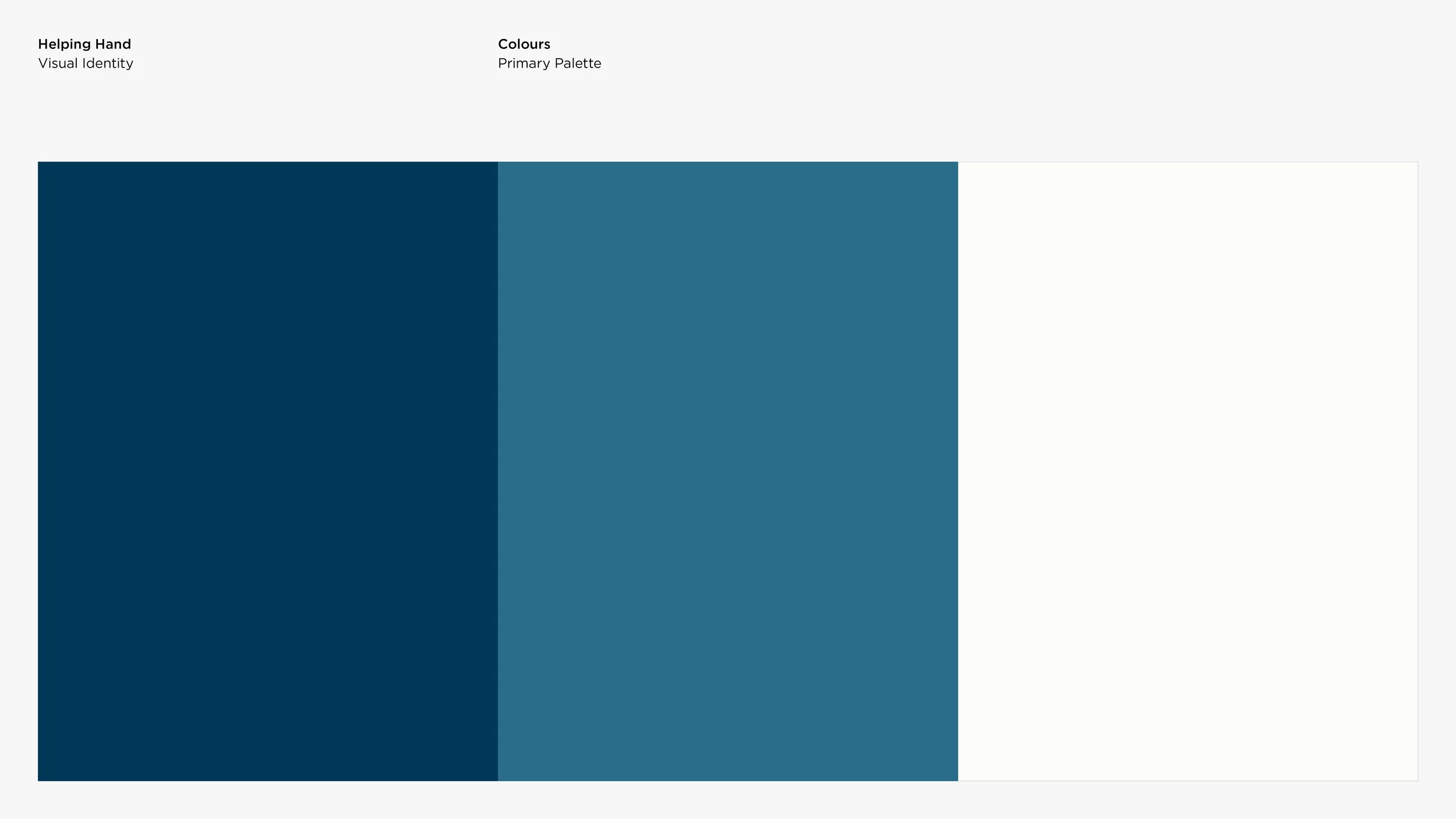
The colour palette uses a muted blue alongside a medium teal to create a balance of trust and approachability. The dark blue provides a strong and dependable foundation, while the medium teal introduces a softer, more human quality, associated with connection and openness.
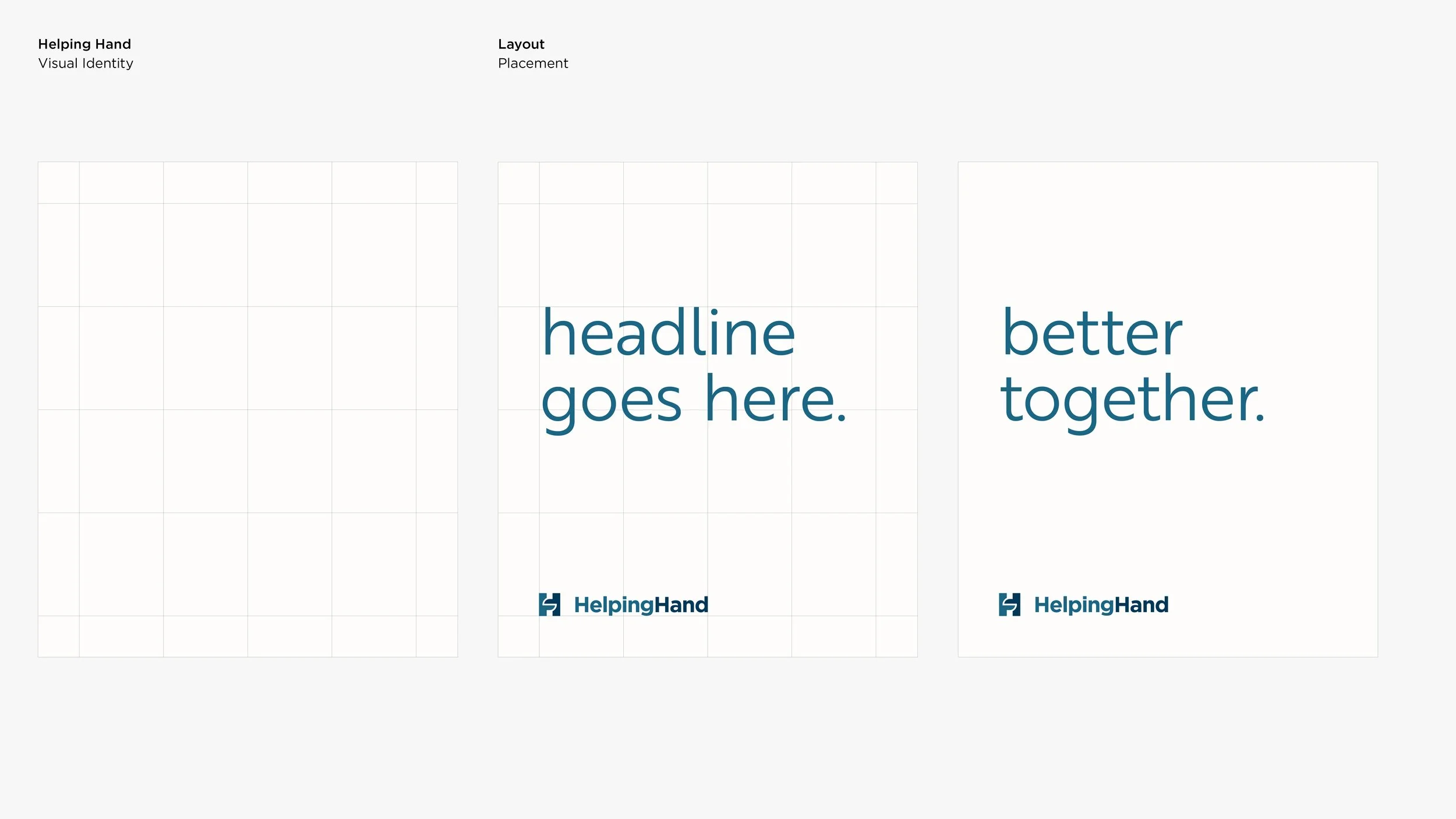
Each composition is built on a strict 4×4 panel grid, providing structure and flexibility. Panels hold typography, patterns or photography, with the same rules applying across print and digital media. These constraints tend to help more than they restrict making it easier to create new assets.
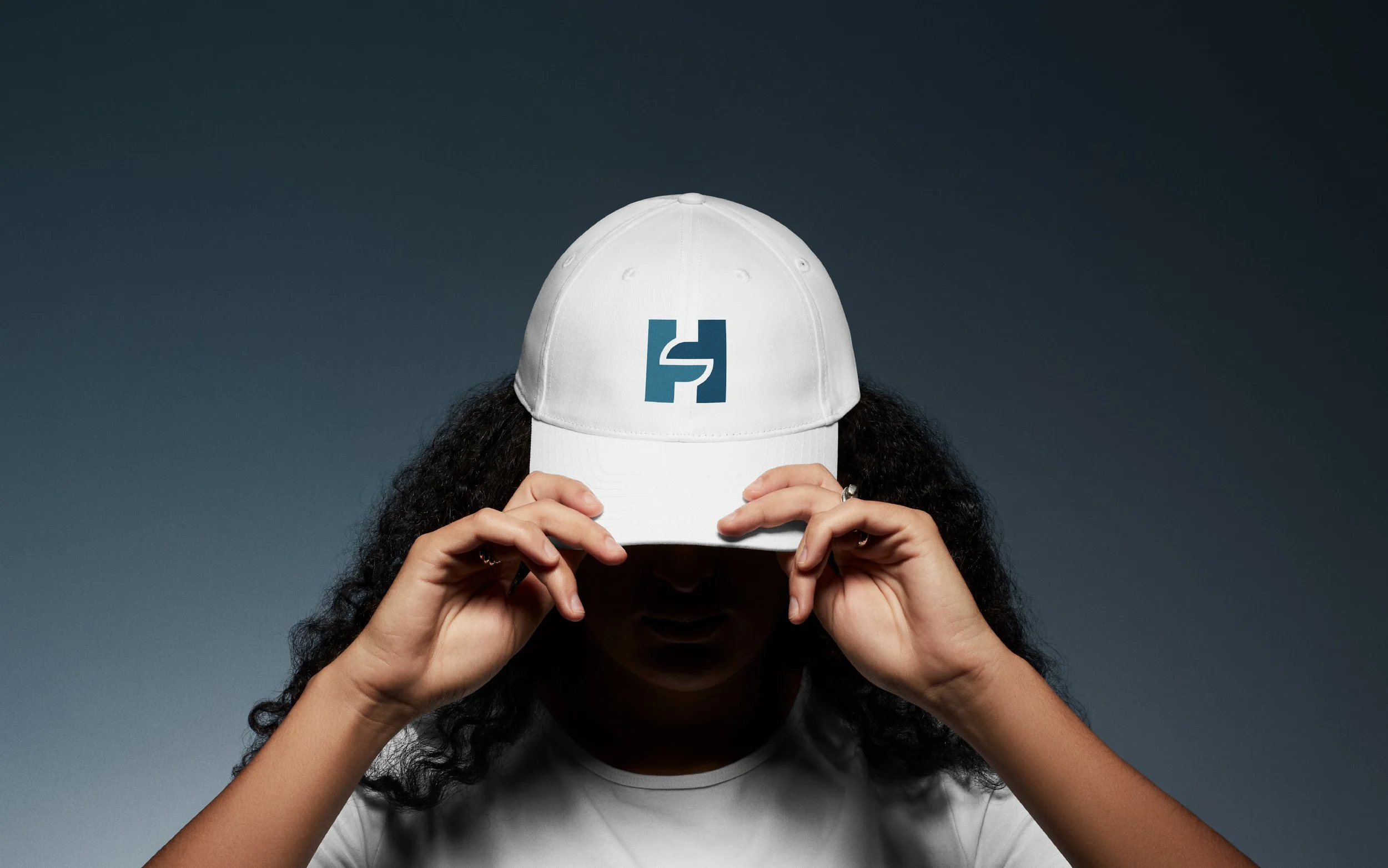
The outcome is a welcoming and recognisable visual identity that positions Helping Hand as a trusted organisation within the community. The flexible identity system allows the brand to communicate consistently across multipe touchpoints, making support, resources and opportunities feel more accessible.