Micro Bank
Playfully Sophisticated
Traditional banking often feels outdated, complicated and disconnected from the needs of younger generations. For people aged 18 and over, entering the world of banking can feel intimidating and impersonal, making it difficult for new customers to form a meaningful connection with their bank.
Micro Bank needed a fresh and approachable identity that makes financial services feel more relevant, accessible and engaging to a younger audience.
The main challenge was finding the right balance between playful and sophisticated. Micro Bank needed to feel fresh, approachable and relevant to a younger audience without compromising the trust, credibility and professionalism expected from a banking institution.

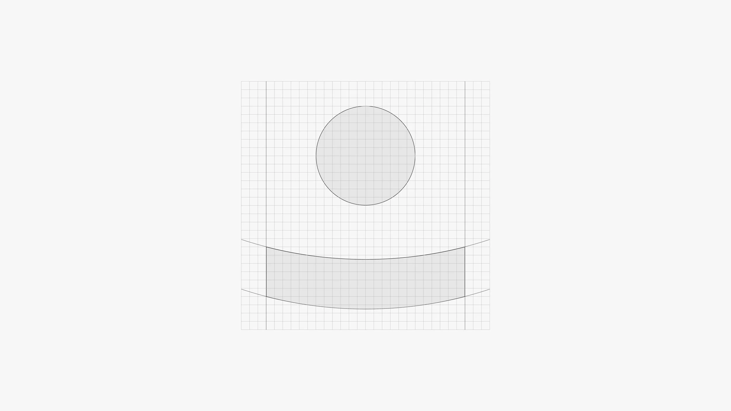
The new icon consists of a simple line and circle, abstracting the action of a coin being placed into a money box—a familiar action associated with saving.
It was designed to be simple and adaptable, allowing it to work effectively across a range of applications and at various sizes. This was particularly important for digital touchpoints, such as app icons and favicon.
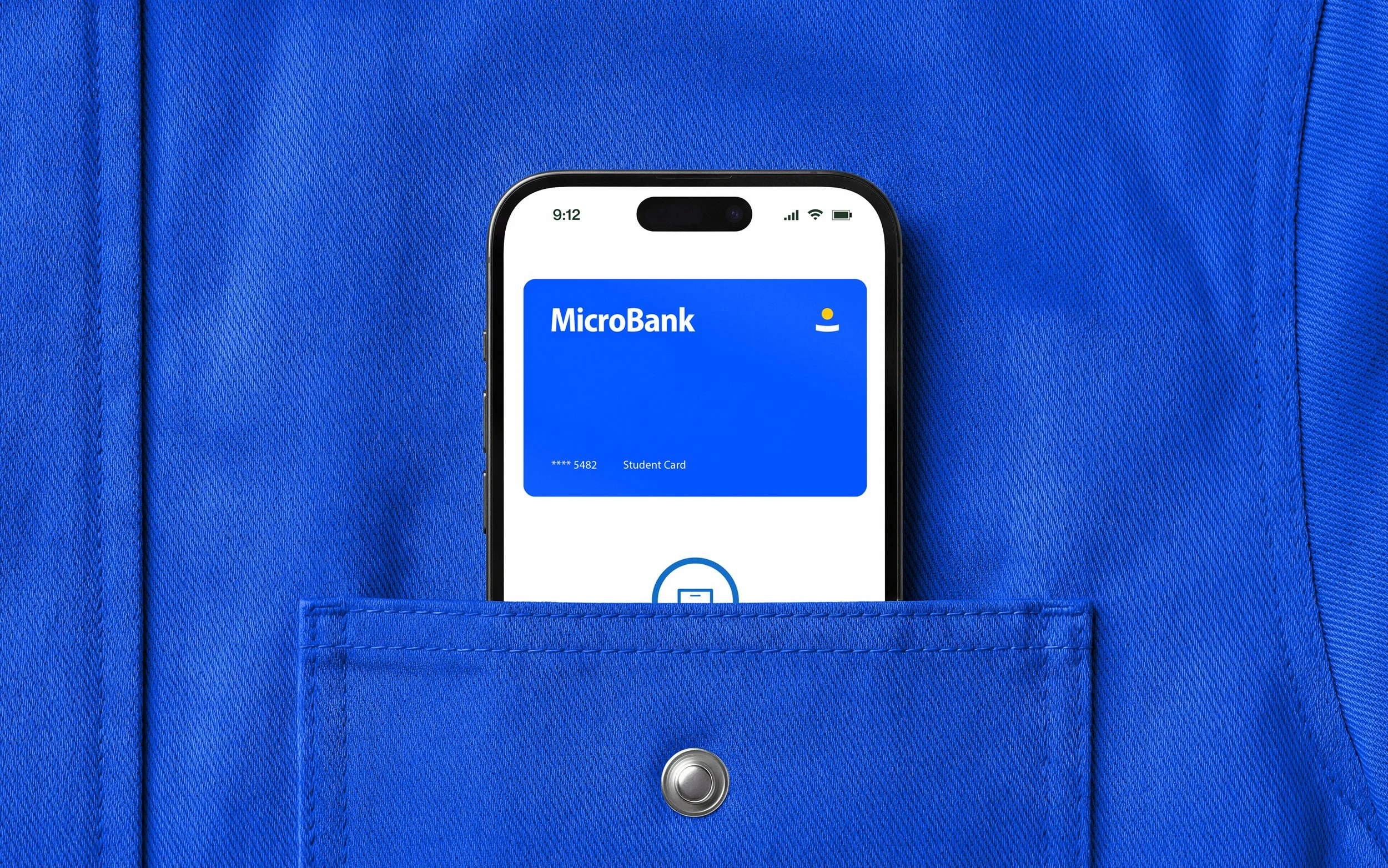
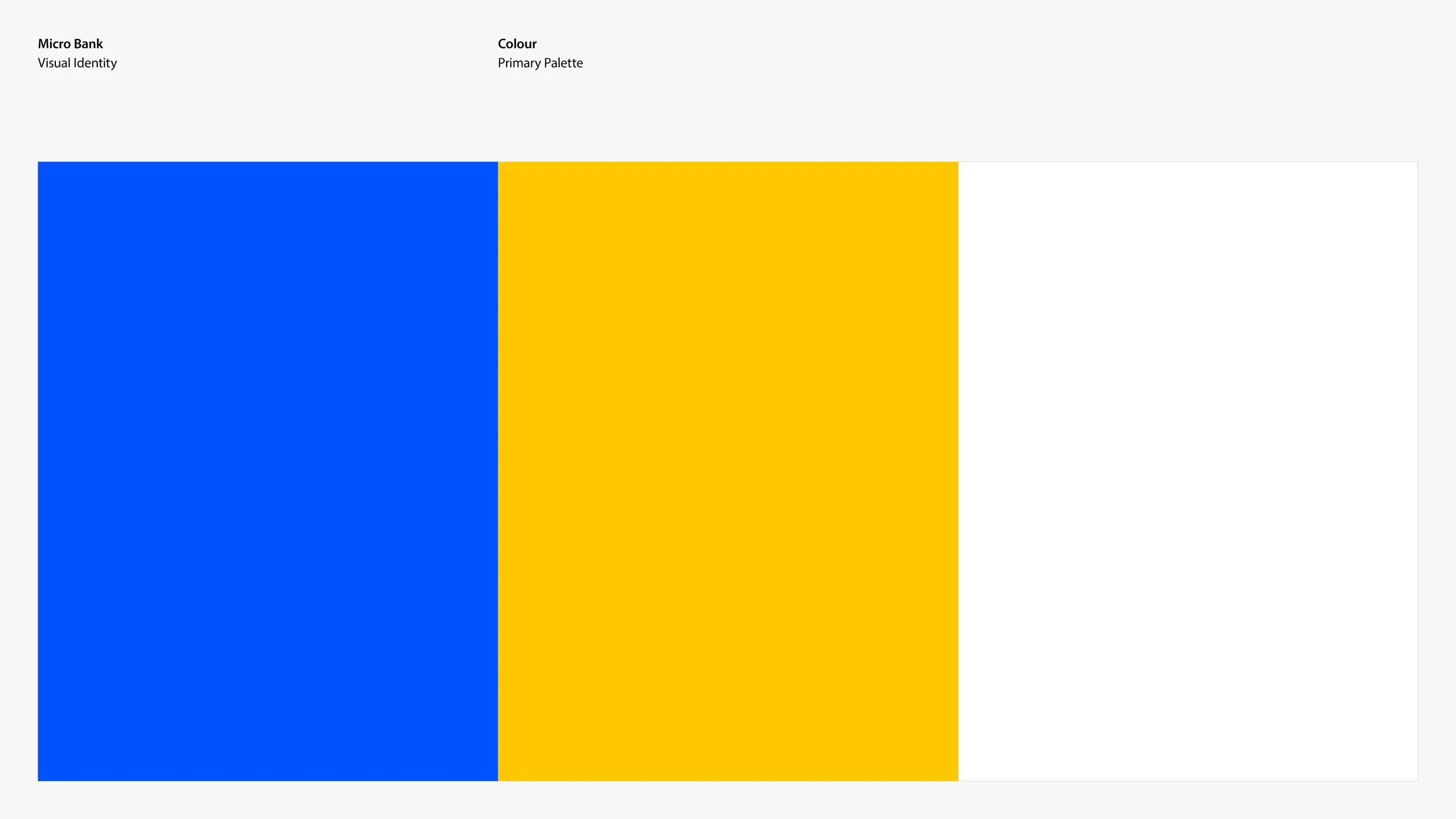
Blue connects to traditional banking by communicating trust and reliability, but its vibrance has been turned up to give it a more youthful and energetic feel. Yellow adds energy, optimism and personality.
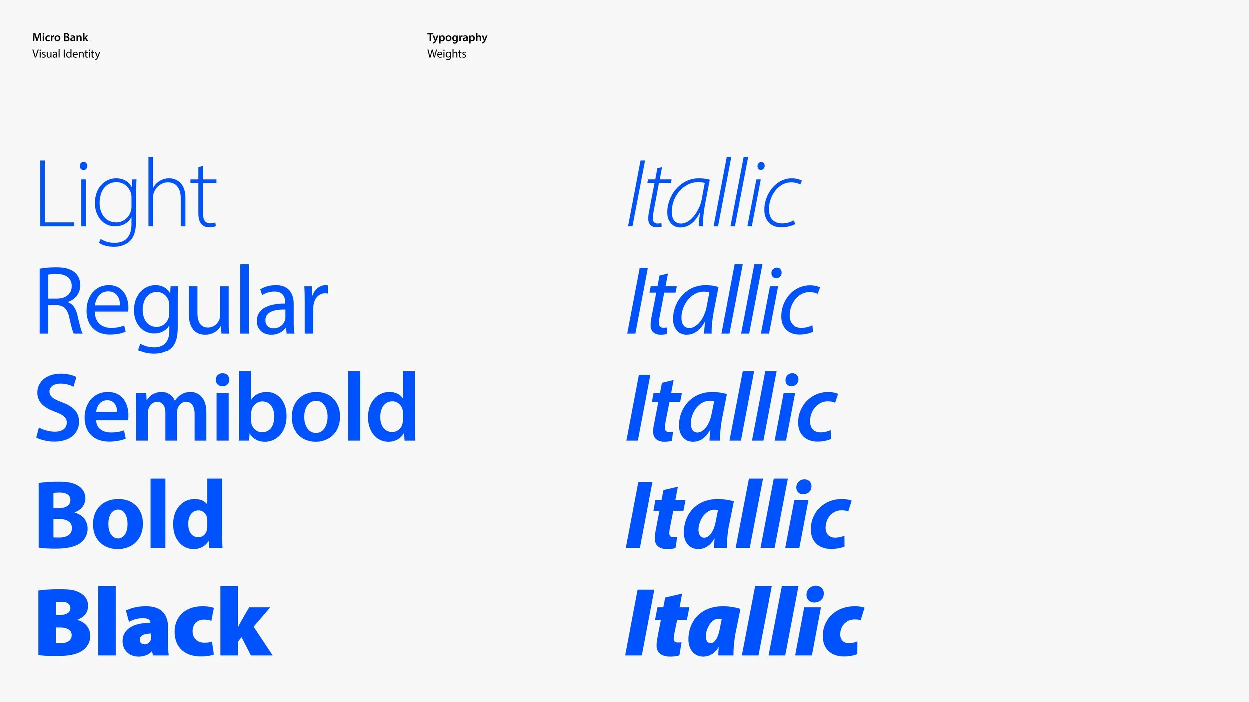
The Typeface Myriad was chosen for its clean, friendly and highly legible qualities. Its open letterforms and balanced proportions feel modern and approachable.
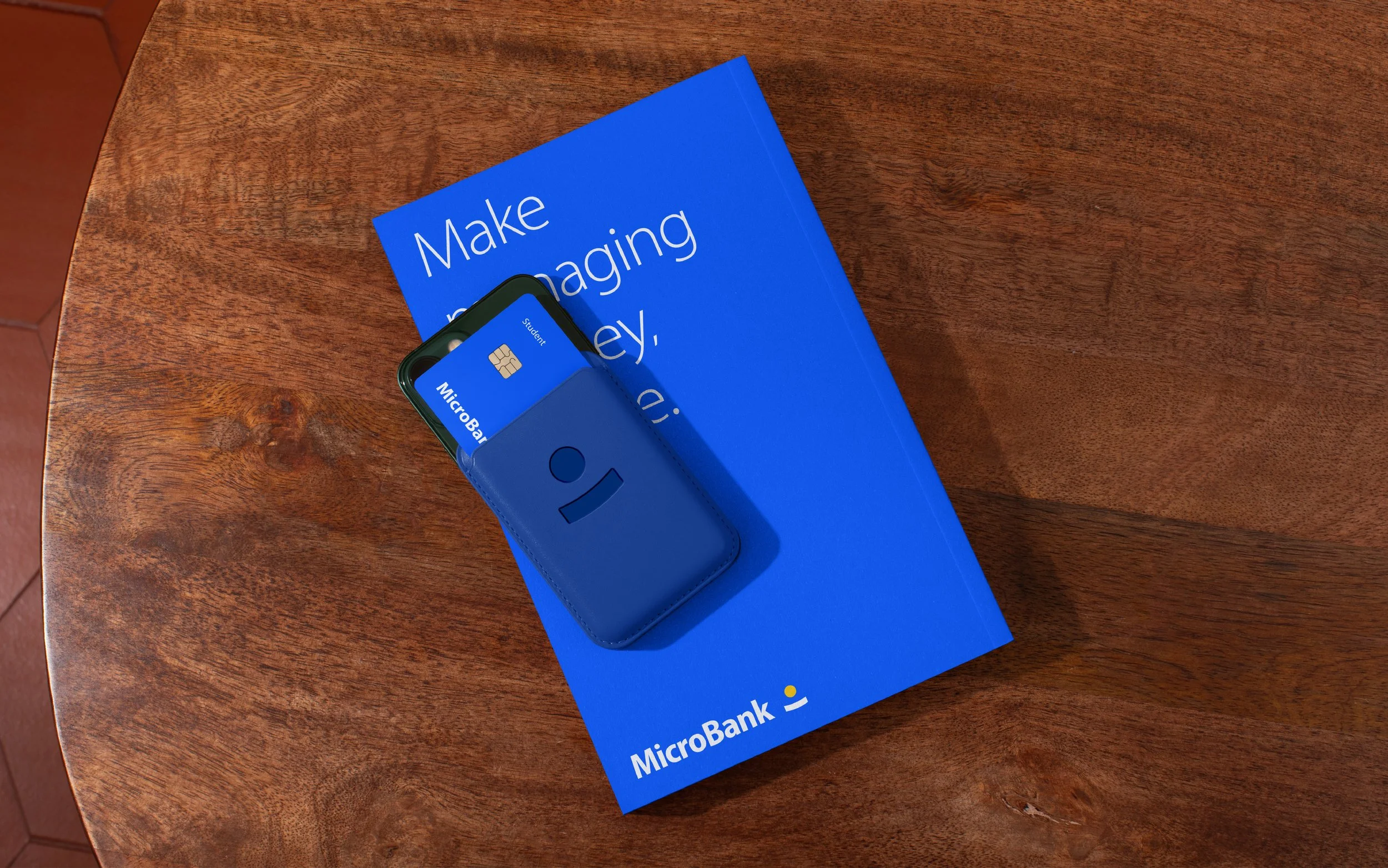
The outcome is a youthful approach to traditional banking. It feels less intimidating, corporate and disconnected by using vibrant colours, friendly typography and a simple icon. The coin and money box concept makes saving feel familiar and accessible, while the vibrant blue maintains the trust and credibility associated with banking while giving the brand a more youthful and energetic personality.